Choosing the Perfect Painting Above Your Bed: A Complete Guide to Bedroom Art
The space above your bed is one of the main focal points in your bedroom. It is the first thing you see when you wake up and the last thing you notice before going to sleep. Choosing the right painting for this spot can turn your bedroom from a simple sleeping area into a personal space that reflects your style, helps you relax, and improves your general well-being.
Why the Painting Above Your Bed Matters
Your bedroom is your private space—a place to rest and recharge. The art above your bed sets the mood for the whole room. Unlike other rooms where art is mostly decorative, bedroom art affects your feelings and mindset. It can influence your mood, sleep quality, and sense of comfort.
Studies show that the images around us can affect our subconscious mind, influencing stress, creativity, and emotions. Choosing bedroom art is not only about looks as well as about your individual well-being.


Size and Proportion: Getting the Dimensions Right
A common mistake is picking artwork that is too small for the bed. A tiny painting above a queen or king bed can make the room feel unbalanced.
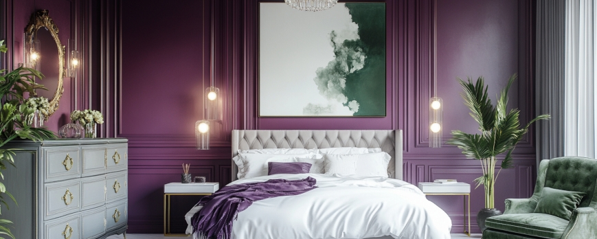
The Two-Thirds Rule
Designers recommend that artwork above a bed should cover about two-thirds to three-quarters of the bed’s width. For a queen bed (60 inches wide), aim for art that is 40-45 inches wide. For a king bed (76 inches wide), aim for 50-57 inches wide.
If one piece is smaller, you can create a gallery wall or add smaller pieces on the sides. This fills the space and adds interest.
Vertical Considerations
Height matters too. Hang the painting so its center is at eye level, usually 57-60 inches from the floor. Leave 6-12 inches between the top of the headboard and the bottom of the painting. This prevents the artwork from feeling cramped.
For tall ceilings, vertical or tall narrow pieces can make the room seem larger and more open.
Color Psychology: Choosing Hues for Rest and Relaxation
The colors in your bedroom art affect the mood and atmosphere of the space.
Calming Cool Tones
Blues, greens, and gentle purples help create calm and relaxation. Blue can lower blood pressure and heart rate, making it good for sleep. Soft greens blend with nature, bringing a refreshing feeling. These colors work well with natural wood furniture and soft textures.
Warm and Inviting
Warm colors like blush pink, taupe, terracotta, or muted coral can evoke a cozy feeling. Use soft, muted shades rather than bright, strong colors so the room stays relaxing.
Neutrals for Multipurpose Use
Neutral colors—white, gray, beige, or charcoal—are timeless and flexible. Neutral artworks with different bedding or accessories. Black-and-white photos or monochrome paintings create calm, modern bedrooms.
Colors to Approach with Caution
Avoid bright red, intense orange, or neon colors—they can be too stimulating for sleep. If you like bright colors, use them only as small accents.


Subject Matter: What Should You Look at Every Day?
The topic of your painting is personal, but some subjects are better for a bedroom.
Nature and Landscapes
Landscapes, seascapes, and plants are calming. Mountains, beaches, forests, and flowers create a peaceful feeling and connect you to nature.
Abstract Art
Abstract paintings let your mind relax and imagine freely. Soft, flowing shapes and gentle colors are best. Watercolor-style washes or simple geometric designs work well.
Figurative Art
Human figures need care. Portraits of strangers can seem intrusive. Gentle silhouettes or romantic couples can offer warmth without distraction. Avoid action or intense expressions.
What to Avoid
Avoid violent, disturbing, chaotic, work-related, or negative images. Your bedroom should feel safe, calm, and restful.
Style Considerations: Matching Art to Your Bedroom Aesthetic
Your art should suit your bedroom style and improve it.
Modern and Contemporary Bedrooms
Use abstract, geometric, or large photography. Black-and-white or single-color paintings work well. Keep the design simple but bold.
Traditional and Classic Bedrooms
Landscapes, still lifes, and floral paintings fit classic rooms. Oil paintings with rich colors and ornate or wooden frames add elegance.
Bohemian and Varied Spaces
Boho rooms allow mix and match. Textiles as art, gallery walls, and colorful pieces work well. Keep a sense of cohesion.
Minimalist Bedrooms
Use one simple, impactful piece with space around it. Monochrome or line drawings work best. Keep the room calm and clean.
Coastal and Beach-Inspired Bedrooms
Seascapes, abstract blues and whites, marine life, or textured canvas is able to evoke the beach. Mixed media, such as sand or shells, adds interest.


Framing and Presentation
The frame affects how the painting looks in your bedroom.
Frame Styles
Ornate frames suit classical art. Simple frames in black, white, or wood fit modern rooms. Floating frames give a gallery look. Frameless canvas wraps or natural wood add coziness without formality.
Matting Decisions
Matting separates the art from the frame. White or cream mats are classic. Colored mats can highlight accent colors, but use them carefully. Modern rooms can skip mats for a clean look.
Glass Considerations
If using glass, choose non-reflective or UV-protective glass to reduce glare and protect the art. Many canvas pieces do not need glass, avoiding reflections.
Practical Points
Realistic factors are also important.
Wall Space and Architecture
Check your wall before hanging large art. Use studs for support. Match the art with wall textures, moldings, or accent colors.
Lighting
Bedroom lighting affects how the painting looks. Check colors in similar light. Add picture lights if the room lacks natural light.
Safety and Stability
Mount paintings securely, especially if you have children or live in an earthquake zone. Use proper hardware and anchors for heavy pieces.
Budget Factors
Art can fit any budget. Prints, works by new artists, or personal photos are affordable. Investing in an original piece can be worthwhile if you love it and will see it every day.
Personal Connection: The Most Important Factor
The best painting above your bed is one that connects with you. It should evoke positive feelings, such as calm, joy, or inspiration.
Don’t choose art only to match bedding or trends. Pick what makes you happy and feels right for your personal space. If a piece breaks design rules but brings you joy, it’s the right choice.


Creating Gallery Walls Above the Bed
If one piece isn’t enough, try a gallery wall.
Planning Your Layout
Plan on the floor or with paper templates. Start with the largest piece and arrange the smaller ones around it. Keep 2-3 inches between pieces.
Cohesion in Variety
Use a unifying element like frame color, shared palette, or theme. Too much variety can look messy.
Symmetry vs. Asymmetry
Symmetrical grids feel calm and organized. Asymmetrical layouts feel dynamic and casual.
Seasonal Changes and Flexibility
You can change art with seasons or tastes. Use ledges for easy swapping or rotate a few favorite pieces during the year.
Conclusion
Choosing the right painting above your bed combines pragmatic needs and personal taste. Consider size, color, subject, style, and most importantly, how it makes you feel. Your bedroom art should help the space feel peaceful and personal.
Your preferences may change over time. Don’t hesitate to update the art when it feels right. The perfect painting is the one that makes you feel calm, happy, and at home.
Take time to choose. Visit galleries, browse online, commission a custom piece, or create your own. The painting above your bed is more than decoration—it is part of your daily life and deserves care.